Wednesday, April 27, 2016
CCEE1617 Baseball
For Anne's last challenge this month, she's reminding you all that it's baseball season again (YAY!). Promote your favorite team, their colors, or just use a baseball theme.
I've always been a Houston Astro fan, even through their trials and tribulations. I found their star logo very easy to duplicate with my SU star punch and then cutting a piece of it out. The design papers are from Graphics 45. The letters are diecut and glued on.
Hope you join us in the fun and link up your card to the CCEEStampers blog and while you are there, don't forget to check out the teams' cards this week.
Sunday, April 24, 2016
Power and Sparkle challenge at Power Poppy
This is for the Power and Sparkle challenge on the Power Poppy Blog. The challenge was to use only 3 colors of markers. I used copic markers: YG03,R02, and Y17. They seemed very springish to me, and the green and white gingham reminds me of the lighter weighted fabrics we wear for warmer weather.
CAS on Sunday challenge #81
I did this for the CAS on Sunday challenge found here:
I went diagonally across the Bingo card to the floral, stamp, and ribbon criteria.
The floral is a digital from Power Poppy, and the sentiment is a stamp from Power Poppy.
I used copic markers for the coloring and this is on a white one layered card.
Labels:
CAS,
CAS on Sunday,
digitals,
Power Poppy,
powerpoppy
Wednesday, April 20, 2016
CCEE1616
Sweet Anne is again hosting our challenge this week. This is her challenge for us this week:
Spring brings lots of changes to our landscapes. Your challenge this week is to make a scenic card...and because I am the hostess, be sure to add some RED!
I used this tree stamp from an old retired Stampin' Up set. My red looks more like a rose pink in this photo, but I used red for the birds, the bird house, and the flowers in the grass.
Come join the fun this week by adding your card to the link over on the CCEE Stampers blog here
Wednesday, April 13, 2016
CCEE1615 Watercolor one layer
Anne is again our hostess and the challenge is to make a one layer card with watercolors.
I used watercolor paper, so I did put mine on a card base, which I guess makes this technically a two layered card. I did a little freehanded watercoloring on this and stamped a sentiment from Power Poppy. I'm still pretty unexperienced with watercolors, but have been really desiring to learn to do a better job with it. It has always been one of my favorite medias and it is fun to see what I can do with it.
/We would love to have you join in on the fun and you can link your card over on the CCEEstampers blog found here. While you are there make sure you check out the creations of the other team members.
ODBDSLC273 ODBD recipe challenge
This is for the Our Daily Bread Designs Shining Light Challenge. We were to use things that begin with the letter O, D, B, and D. O is for one layer, d is for daisies, b is for butterflies, and d is for a "dear" sentiment. You don't see all that many one layer cards done by design teams for companies, so I decided that would be rather challenging especially for a recipe card.
Friday, April 8, 2016
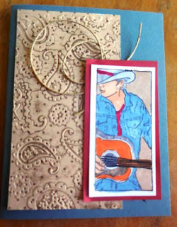
Paper Player 289
This card is for the Paper Players weekly challenge. This week the theme was western. I used this stamp I love from Deadbeat designs. I tried to go for a tooled leather look for the design paper, and used a little twine to look "ropish."
As a resident of Texas, I just couldn't pass this week's challenge by. We love our cowboys!!
Wednesday, April 6, 2016
CCEE1614 - Masculine and plaid
Anne Harmon is our new hostess for the month of April. For our first challenge, please make a masculine card using plaid (paper or stamp).
Since I found this great green plaid in a pad from Graphics 45, I just had to make this a golfing card. My son, Matt will be celebrating a birthday in May, so decided this was a great one because he is the golfer in the family!
Saturday, April 2, 2016
Less is More 270
Subscribe to:
Posts (Atom)


